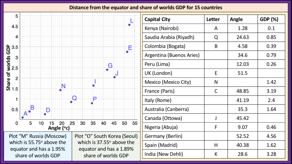
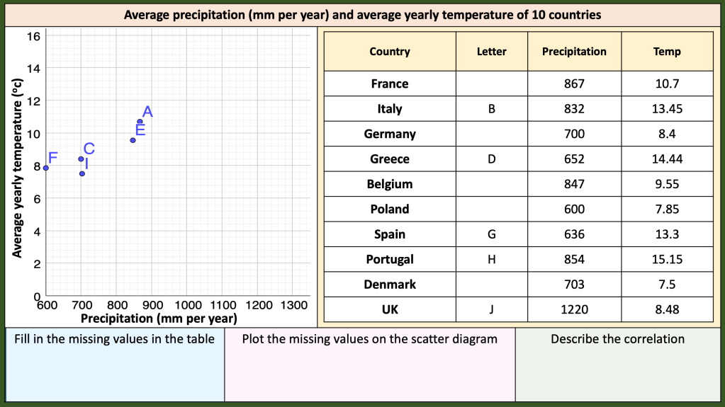
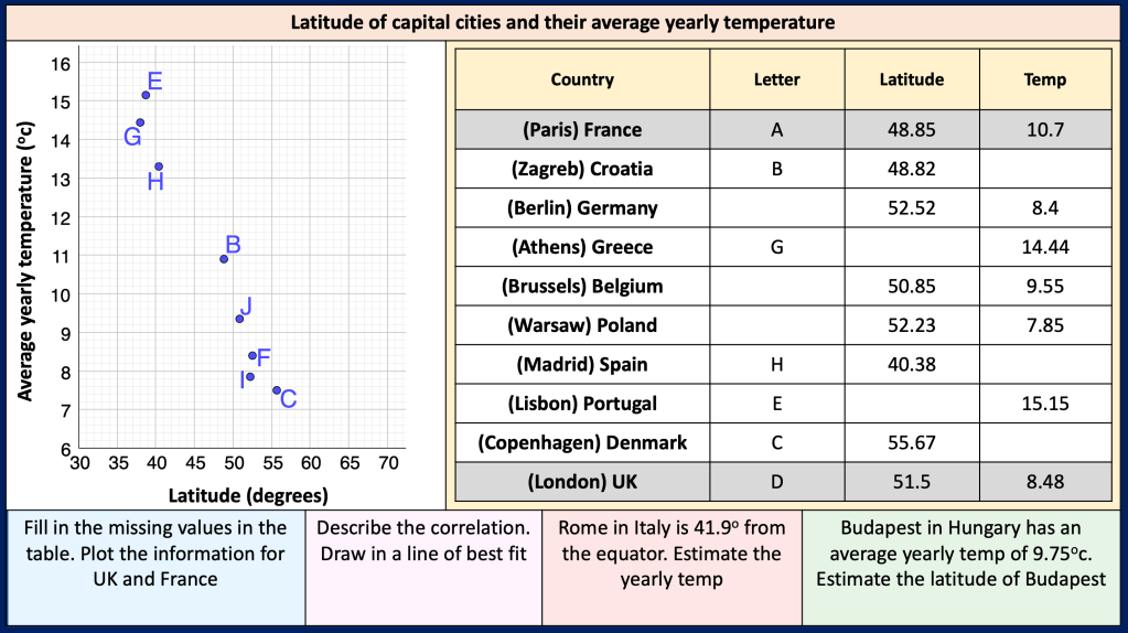
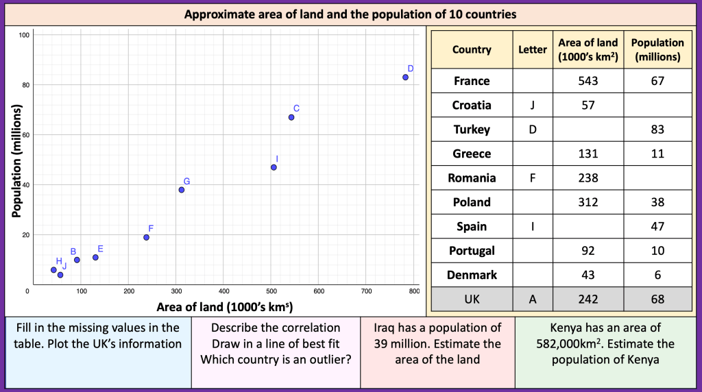
I had a look at GDP, weather, population, Area of land to create some scatter diagrams.
I wondered about what students could deduce from the results and comment on the correlations.
I will be explaining how I obtained the data and discuss how the scatter diagrams are misleading because of the small sample size. We will discuss what can be deduced from the results and if the results are misleading/bias.

Nice use of the data.
The axes labels on the first graph of angle and gdp are the wrong way round.
LikeLike
I’ve amended those 👍
LikeLiked by 1 person
Hi, I would love a copy of this as it would work really well in Geography
LikeLike
Are the images ok to copy? I copy the images I make into a ppt
LikeLike