
I am about to teach Pie Charts to year 9 and have decided to look at reading and interpreting them first. I want them to understand that the slice of the pie is proportional to the number of people. So that if a third of the pie is one group then that might be 10 out of 30, 12 out of 36. So if you are comparing two pie charts side by side you need to know how many people are being represented.
Students need to see that if
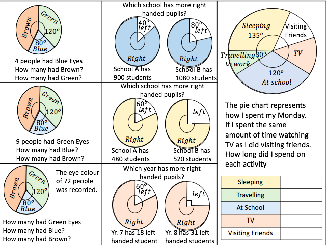
90° represents 8 people
45° represents 4 people
135° represents 12 people
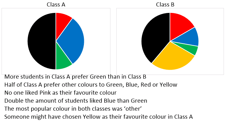
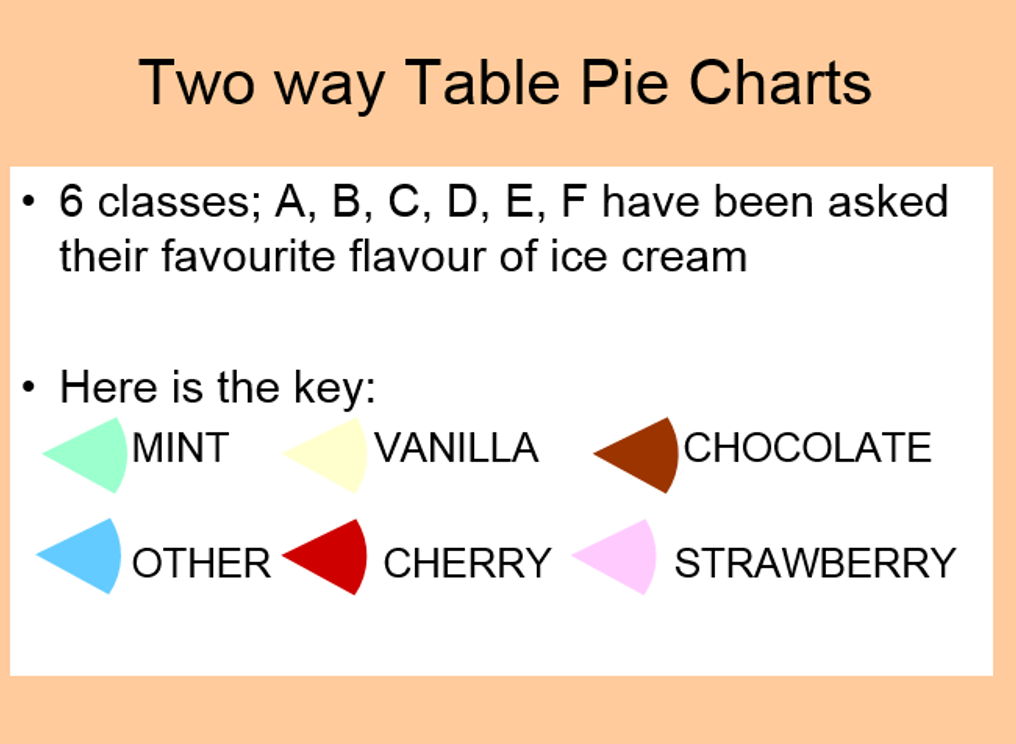
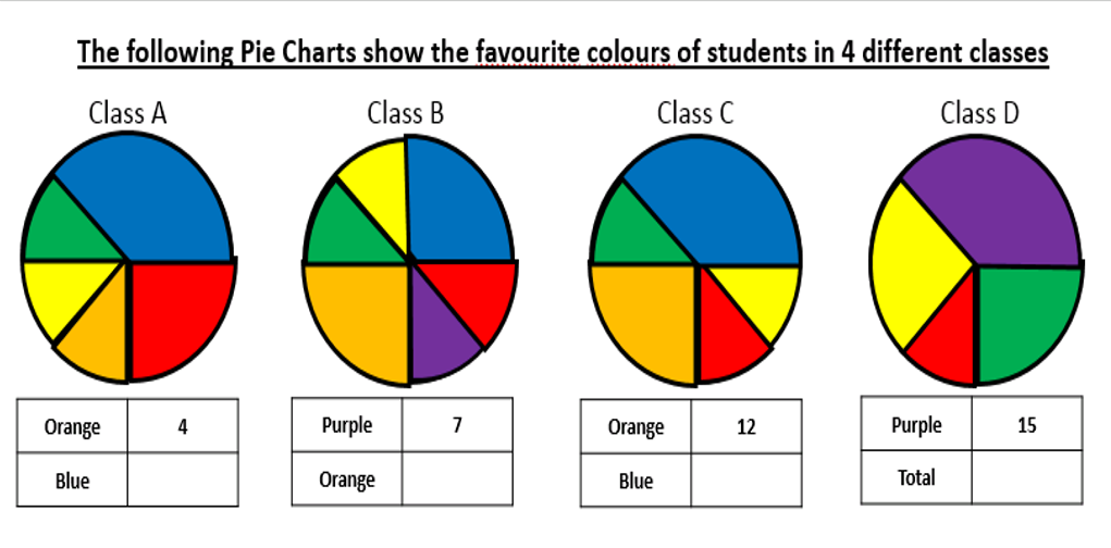
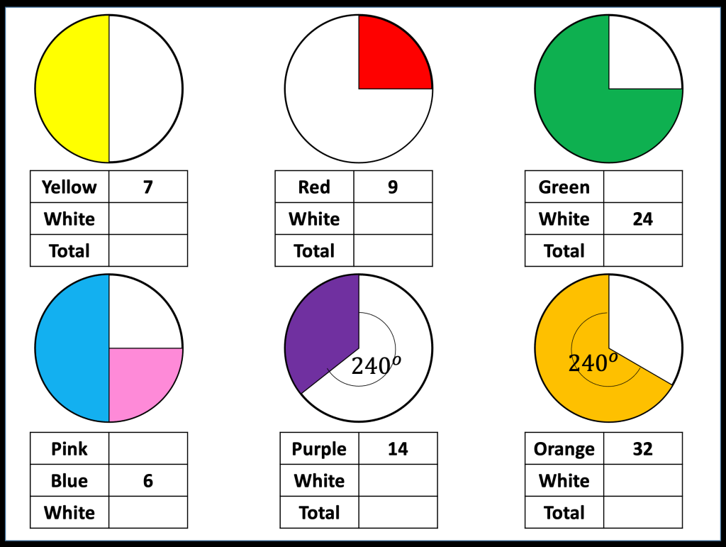
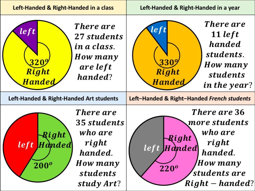
I want to ask questions (TRUE/FALSE) to see what misconceptions students have when understanding Pie Charts. There are lots of much better questions but these are what i have so far. I created this two way table for pie charts and it has two gaps for pie to be created to fit the remaining spaces.

Below are the ppt and worksheet for pie charts
Update!
Here is a little pie chart activity i used with my class when i taught proportion
I have been marking the November GCSE Maths resit and there was a pie chart question on it that candidates really struggled with. With an understanding of proportional reasoning, candidates would be able to answer the question.


Thank you so much for these questions. For years I have taught Pie Charts the same way …. this has shown me a different approach; ones that encourage thought!
LikeLike